Domain.com Brand
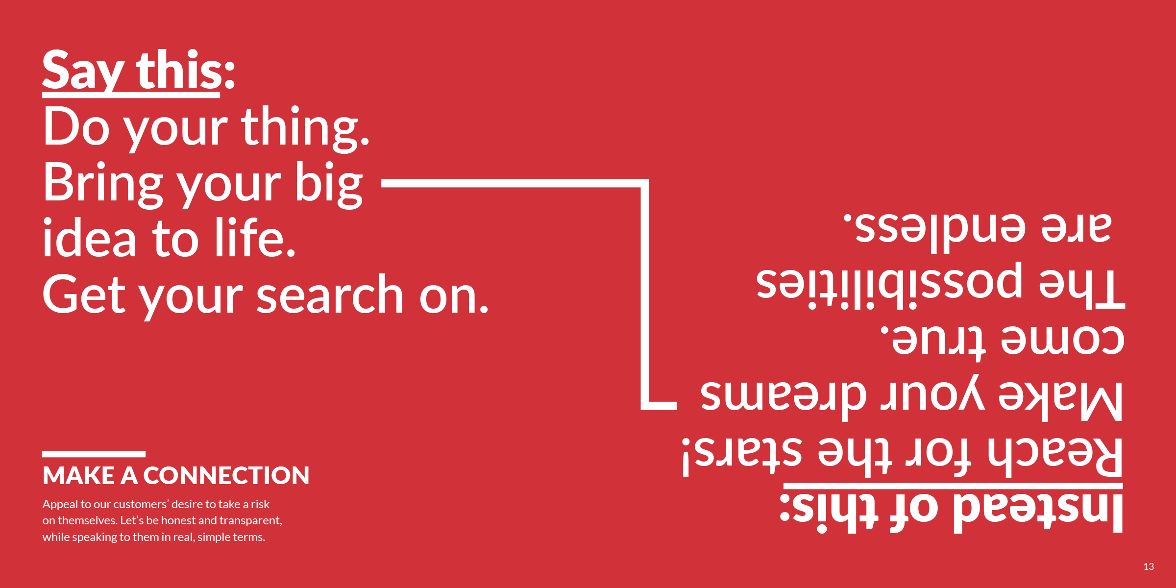
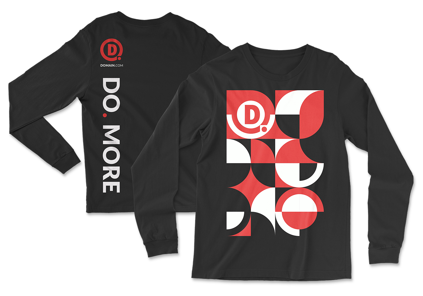
Before 2019, Domain.com didn’t have much of a brand to speak of, just a logo and the color of red to work with. After spending months of working through new website designs, a brand started to take shape. We defined who Domain.com was, documented the visual strategy, provided guiding principles, and finally shared the brand with a printed a guide book that’s informative, interactive, and packed with edge and personality.


See the book in action.
While looking at the digital version of our guide is great, I can do you one better. Here’s a full video “flip through” of the brand book itself, showcasing the interactive elements of our printed brand book, including the custom patterns, textures, and color-trick pages.

Load up a playlist and listen to our sound.
Part of the Domain.com brand book is an interactive Spotify scan code right inside the cover. This anthem playlist gives the backdrop to the energy and motivation that we want to give our customers.
Domain.com also publishes curated playlists that elevate each TLD we offer, giving a soundtrack to the domain.
Check us out on Spotify →
The overall brand book design was inspired by the layout and feel of a vinyl record. The attitude, the shape, and general layout are a nod to what you might experience opening up a double LP record of your favorite underground band. The printed book also includes a few interactive elements, like our personal mixtape you can hear on Spotify by scanning the first page with your phone or the color trick pages where words can vanish or appear.
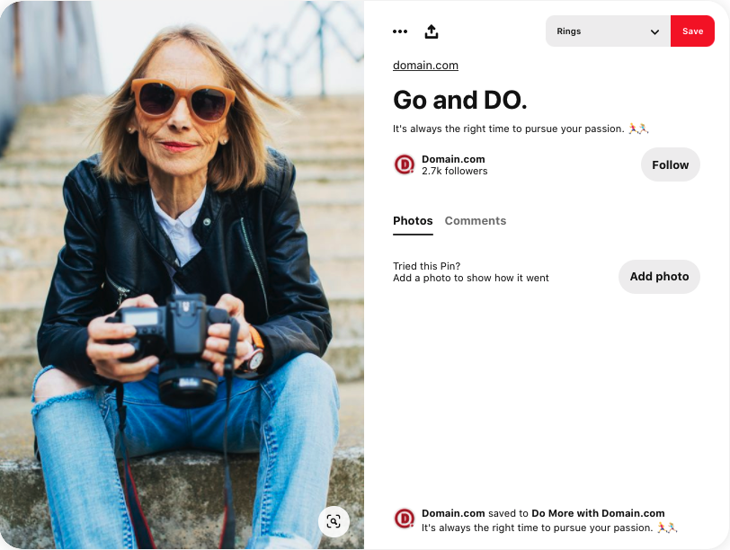
In 2020, we also partnered with the Domain.com content team to create a social presence that is both educational and representative of our brand identity. The content we’re creating spans across Instagram and Pinterest, and has even expanded on Spotify where we create TLD-inspired playlists. Most importantly, the brand has seen a 22% increase in engagement on social.
I was responsible for creating the overall brand vision, documenting the guidelines and identity, and lead a project team to create all assets for the brand.


